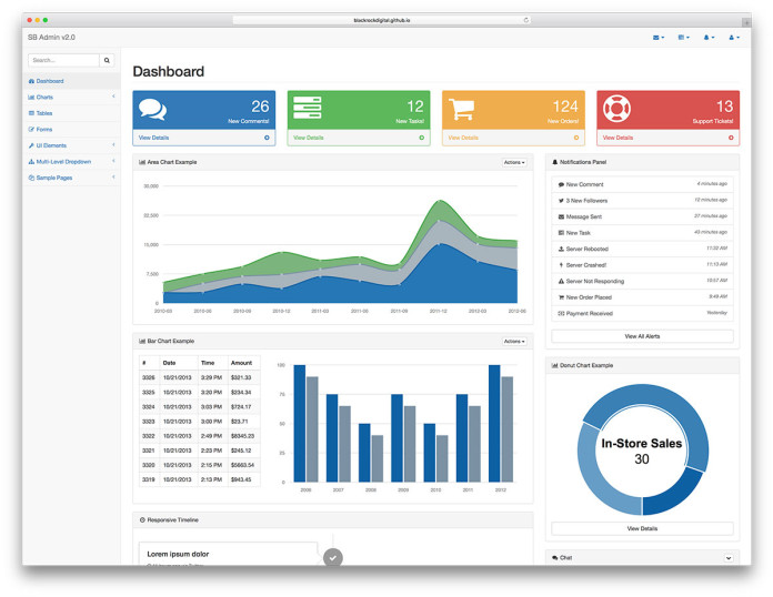
Dashboards come in 2 flavors, Portals and Scorecards. A portal is a central place for links and other references all in one place for fast navigation for a Subject Matter Expert (SME).
A scorecard tells the health of a business within 5 seconds of viewing. If you cannot do that, chances are you are building a portal. If you are making a scorecard type, you will want to consider these four levels.
A WELL DESIGNED DASHBOARD IS A VISUAL DISPLAY OF THE MOST IMPORTANT INFORMATION NEEDED TO ACHIEVE ONE OR MORE OBJECTIVES WHICH FITS ENTIRELY ON A SINGLE COMPUTER SCREEN SO IT CAN BE MONITORED AT A GLANCE – STEPHEN FEW
Level 1 – Discovery: Landing Page or the Dashboard Layout
- It covers all the main domains of your business.
- The dashboard has main KPIs for each business domain with an aggregated number.
- It may contain symbols or colors or both to represent status and trends.
- Add comparative context e.g., Month over Month or Target Goal over Actual performance, to create a spatial dimension.
Level 2 – Diagnosis: Summary Layer
Summary Layer decomposes the Main number on the Level 1 dashboard page. Each domain metric comprises 3-7 leading KPIs contributing to the KPI number on the Level 1 aggregated numbers. While Level 1 shows a metric we measure, it is usually a lagging indicator. You cannot do anything to alter this number once it is revealed. At Level 2, these are leading indicators, and changes can impact the outcome at Level 1.
Level 3 – Decision: Guided Analysis Layer
Each KPI at level 2 can be explained by a detailed report with many more attributes supporting the data shown. One or many Leading KPIs at level 2 might have a guided report explaining more details about the leading indicator.
Level 4 – Directives: Detailed Layer
These are the base transactions that support the guided analysis layer. It is at this level that Root Cause Analysis can confirm the insight of Level 3.
Let us begin a journey of serving information at the right time and in consumable bite-sized chunks. Speedy and right-sized data facilitates proper learning and aids in executing the ideal action for a positive outcome.
Most Importantly, Validate the Design
- Target a specific audience, the more precise the audience, the better your success rate.
- Involve end-users in the design process. Get their approval that it works for their workflow.
The question is NOT can it be done, but should it be done? Will anyone care if it is done?
Sharing is Caring. Thanks for reading and Sharing ❤


