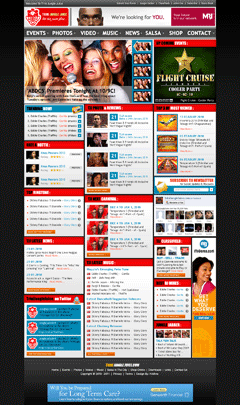
Good Design is Thinking made Visual. Big redesigns are a very dangerous strategy. Continuous improvement of your customers’ top tasks is much better. Continuous improvement implies lots of testing and observation of customer behaviour.
There are three central reasons why we should move to a continuous improvement of top tasks model of management. Firstly, the world is a very complex place. It is extraordinarily difficult to get everything right in one big design. Much better to try a little and test. Test a heading, test a link, test an image at one size, then another. Keep testing and learning and refining.
The second reason is because we can. Before the Web it was incredibly hard to measure how people reacted to content. The Web is an amazing laboratory of content where we can observe how people are behaving and reacting. That’s an amazing opportunity for a content professional. We should grab it with both hands.
The third reason is about your business. Web redesigns may be good projects but they rarely deliver value. Continuous improvement delivers real value. We can prove that making a small change can make a big difference. We can show that a focus on quality delivers. If you can link yourself to quality and value delivery, then that’s a really good career move.
HTML/ CSS redesign
MODx CMS


I agree based upon our prior discussions. I am for evolution over revolution except where revolution is a necessity because evolution is not practical.
Comments are closed.